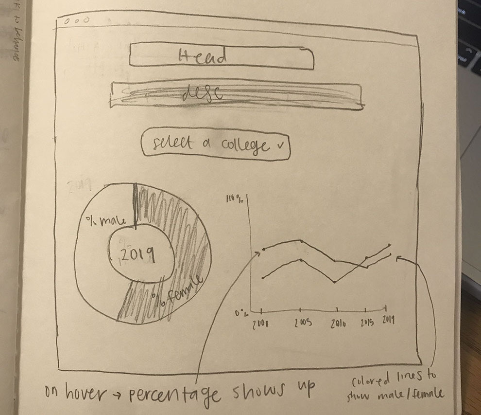
By the Numbers

Interactive Data Visualization

Project Summary

I created this interactive data visualization using data from the Ohio University Office of Institutional Research on the first-year student enrollment by sex and college from 2000 – 2019.

View live site

My Role

Responsibilities

Tools Used

Concept Sketch

I started this project by creating a sketch of my plan for the layout of the visualization.

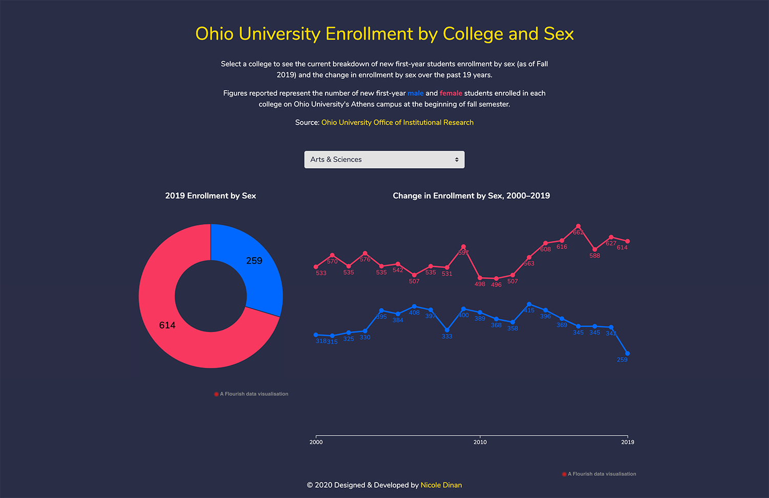
My idea was to create an interactive web page that shows the breakdown of the first-year enrollment by sex for each college. The page would have a drop down menu to select a college and then have embedded charts (made with Flourish) that populate beneath the drop down when a college is selected.

concept sketch
flourish charts screenshot

Charts

To represent the most recent percentages of male and female students (2019), I used a donut chart and to represent the changes in these numbers over the last 19 years I used a line chart.

I built these charts in Flourish, using data from Ohio University's Office of Institutional Research.

Figures reported represent the number of new first-year male and female students enrolled in each college on Ohio University's Athens campus at the beginning of fall semester.

Mockup

I created a mockup in Figma of what I wanted this data visualization to look like.

View mockup
figma mockup
screenshot of live site

Live Site

After creating the charts from the data, I coded a web page to display the data visualization in a way that let people interact with it and explore it. I used HTML, CSS and JavaScript to build the page

View live site

Features

Embedded Flourish Charts

I used Flourish to create the charts that this data visualization displays. While there are some design limitations that come with embedding Flourish charts, it was the most efficient way I found to display the data in an interactive format.

Drop Down Selector

I included a drop down selector in this site so that people could select the college that they are interested in seeing the data for. This helps eliminate the information overload that could occur if all of the data visualizations were displayed at once.

Return to Gallery